I wasn’t able to try this until recently (mostly because I’ve been extremely busy finishing stuff) which is why I’m only posting about Gmail’s Priority Inbox just now.
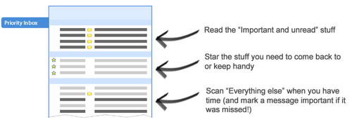
So what exactly does the Priority Inbox do? As the name implies, it’s a sort of email segregation but it’s not just another implementation of tags, and stars (both of which already present in Gmail). Instead, it’s a visual segregation of your emails that will allow you to see which emails you need/want to prioritize in your inbox… hence the name 🙂
Here’s a video from the Google team for a complete overview:
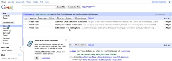
Basically, you now how 3 areas for your mail. The top portion contains important emails which we refer to as Priority, the second portion is for Starred emails and the bottom is for the rest of your inbox. Smart eh? Of course if you’d rather have the old inbox, you can easily switch between the regular Inbox and the Priority Inbox via the links on the side panel of your Gmail interface.
Of course this is only available to users who use the online version of Gmail. Those of us behind Thunderbird or Apple Mail will have to rely on our user defined filters to segregate our emails but hey, it’s an interesting development. I’d love to see this implemented onto the Android platform. I’d have to deal with less clutter browsing email on my mobile :).
Any thoughts on Gmail’s Prioity Inbox? Please do share it in the comments.


